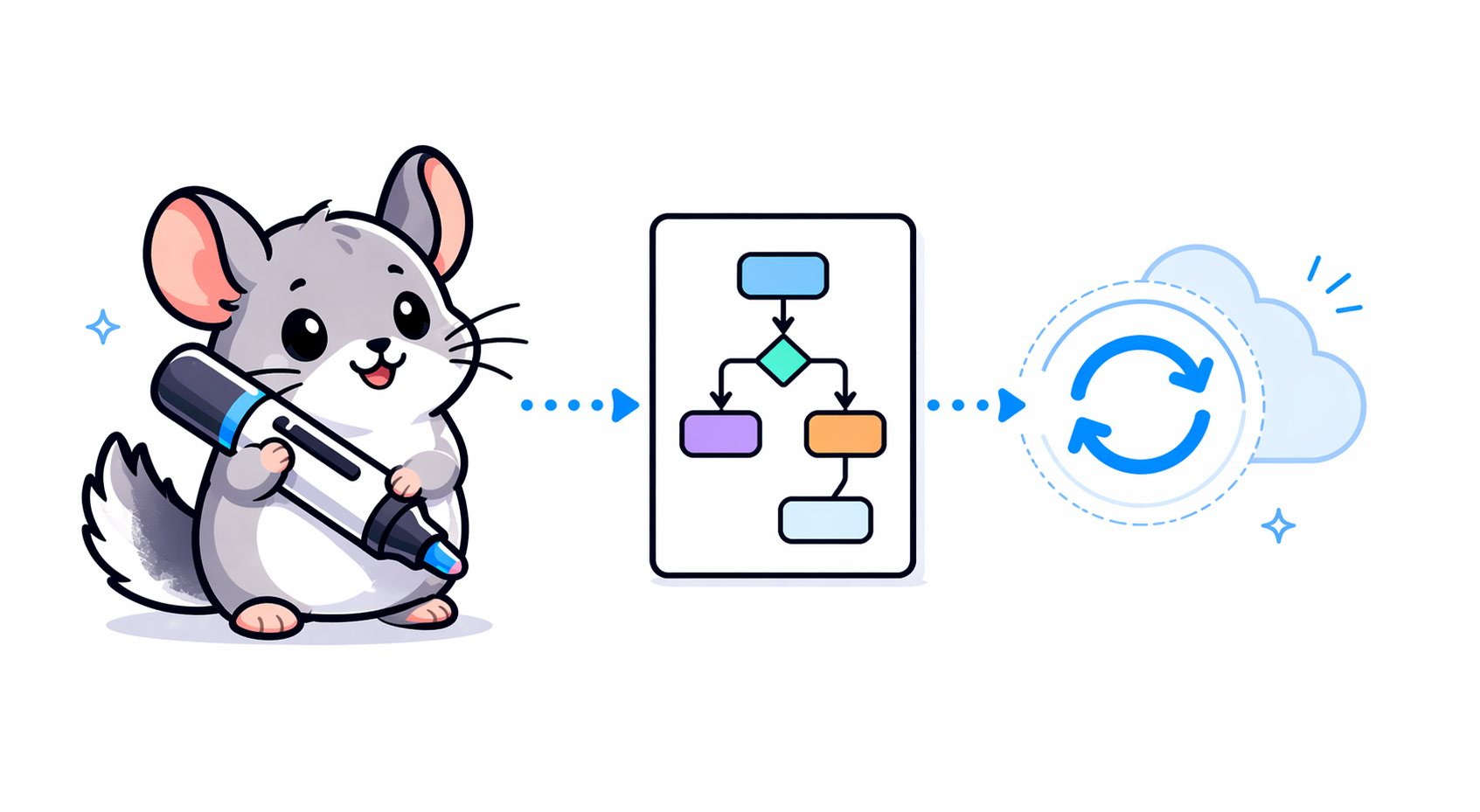
How to embed a live, interactive architecture diagram in your GitHub README
GitHub strips iframes from READMEs. Here's how to get a live, auto-updating architecture diagram in your README anyway, in 60 seconds.
Your repo's README is the first thing visitors see. If it has an architecture diagram, it's almost always one of three things:
A static PNG that goes stale the day after you commit it.
A Mermaid block that renders fine but does not move, simulate, or teach anyone what the system actually does at runtime.
A link to a Figma file behind a login wall.
There's a better pattern that works on any GitHub README today: a live-rendered preview image that links to an interactive diagram. No manual screenshots, no stale diagrams. This post shows you how, in three ways from easiest to most flexible.
First: why you can't iframe directly in a README
GitHub renders a strict subset of HTML in markdown files. <iframe> tags are stripped for security reasons. This is non-negotiable and will not change.
What you can do inside a README.md:
Markdown image syntax: 
Markdown link syntax: [text](url)text
The combined clickable-image pattern: [alt](http://vscodecontentref/3)
Everything below builds on that last pattern. The trick is picking the right image URL and link URL.
Method 1: Manual PNG linked to a live diagram
If you already have a diagram tool and a public URL for the rendered version:
[](https://your-diagram-url.example.com)
The image renders inline. A click takes the visitor to the live view.
Pros: Zero setup. Works on any markdown surface GitHub renders.
Cons: You have to manually re-export the PNG every time the architecture changes. In practice, nobody does, and the diagram goes stale.
Method 2: Auto-rendered preview image that stays fresh forever
This is the pattern worth knowing. Instead of committing a PNG file, point the image URL at an endpoint that renders the preview server-side on every request. When you re-publish the diagram, every README preview updates automatically. Zero commits, zero stale screenshots.
With Chinilla specifically, after you publish a diagram the app hands you a copy-ready markdown snippet that looks like this:
[](https://chinilla.dev/share/YOUR_TOKEN)
The og.png at the end is the magic part. It's a live endpoint that renders a fresh preview image of your current diagram every time it's requested. Click the image in GitHub and you land in the full interactive canvas: pan, zoom, hover into components, and run a simulation of traffic moving through the system.
Paste that one line in README.md. Push. Done.
Pros: Live preview that auto-updates. Live interaction behind the click. Works on GitHub, GitLab, Bitbucket, anywhere markdown renders.
Cons: Requires a diagram tool that renders preview images server-side. Chinilla does. Most whiteboard tools don't.
Method 3: True iframe embed in your docs site
If you have a docs site (Mintlify, Docusaurus, Nextra, MkDocs, even plain GitHub Pages), the docs site can embed the iframe directly and the README can link to it.
The iframe snippet Chinilla gives you looks like this:
<iframe
src="https://chinilla.dev/share/YOUR_TOKEN"
width="100%"
height="640"
style="border:0;"
loading="lazy"
title="Chinilla diagram">
</iframe>
Drop it into your docs page. Then from your README:
[See the live, interactive architecture diagram](https://your-docs-site.example.com/architecture)
Or combine Methods 2 and 3: put the auto-rendered preview image in the README (Method 2) and embed the full iframe in your docs site (Method 3). Best of both.
How to generate the diagram in the first place
All three methods above have the same upstream problem: you still need a diagram. If you draw it by hand, it goes stale the moment someone adds a service or renames a route.
This is where Chinilla's GitHub integration comes in. Connect a repo and it:
Scans the codebase (supports 15+ languages plus YAML, JSON, TOML, XML configs).
Detects services, queues, channels, databases, and request/response loops.
Produces a polished diagram with clean labels and behavior modes you can simulate.
Click publish, and the app hands you three things in one panel:
A share link to the live interactive canvas.
A markdown snippet with the auto-rendered og.png preview (Method 2 above), ready to paste in a README.
An iframe snippet for docs sites and wikis (Method 3 above).
Repo analysis is a Pro feature. You can also build diagrams manually or by pasting code snippets, and the publish and embed flow works identically.
A complete README pattern
Here's what we recommend for any project that has more than two services:
# My Project
A short tagline about what it does.
## Architecture
[](https://chinilla.dev/share/YOUR_TOKEN)
> Click the diagram to explore the interactive version and run a simulation.
## Quick start
...
Four lines of markdown. Visitors see the current architecture at a glance, click it, and land in an interactive view that explains the system better than any wiki page could.
Why bother
Onboarding speed. New contributors understand the system in minutes instead of grepping for entry points.
Documentation that doesn't lie. A live diagram tied to your repo doesn't drift away from reality.
Better issue triage. "It's slow" becomes "the queue between A and B is the bottleneck" once anyone can run a simulation.
It looks great. A live diagram in your README signals that the project takes documentation seriously. That alone wins stars.
TL;DR
GitHub README does not allow raw
<iframe>. Embed iframes in your docs site or GitHub Pages instead, and link to them from the README.For a live, auto-updating README preview, use the [alt](http://vscodecontentref/7) pattern with a diagram service that renders preview images server-side.
Don't hand-draw the diagram. Generate it from your source so it stays in sync with reality.
Chinilla generates the diagram, the share URL, the auto-rendered preview image, and both markdown and iframe snippets in one click. Try it on any public repo.
Want to try it? Open the workspace and paste any public GitHub URL.
Repo analysis is a Pro feature; see pricing for details.